
There seems to be renewed interest in my fonts recently, I'm not sure why. But it's spurred me to go back to updating them for the modern world. Now that I'm not restricted to 224 usable character slots, I've been expanding them a bit, adding new ligatures and features. But now comes the tedious part: kerning all the new glyphs.
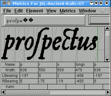
For each new letter or ligature, I have to put it next to every other letter which might reasonably be expected to appear next to it (on either side) and make sure it looks good — and tweak the kerning if they don't. This is especially important if there's an overhang or underhang ("To" will require a tighter kerning than "Th", for example). For period-style typefaces, reproducing the look of lead type, one would expect that there wouldn't be much need for kerning — with solid type, you can't shove the 'o' under the overhang of the 'T', after all — but since the better foundries would often cast special type for such cases, you should kern for the best-looking result anyway.
That's just the tedious part, though. The tough part is getting the OpenType features in there and making sure they work right. While there are a couple of applications which support OpenType ligatures — InDesign, for example, or the Linux version of Firefox — I haven't found anything yet that supports all the OpenType features (like initial/medial/terminal forms of the same letter). It's hard to be sure everything's set up right when there's nothing that actually displays them yet.
BTW - e-mail me about how to get to the CC recordings on your site. You got your check, n'est-ce pas?
Yes, I did, thanks.
sheverb
Rooster Spice
Slacktivist
48 Dead Horses
World O'Crap
Shipbrook EeePC
Comics Curmudgeon
CIDU
Waiter Rant
girlofwords
Blag Hag
Pharyngula
Friendly Atheist
NukeExCathedra
musical troupe
The one in the middle...
The one on the left...
And the guy in the rear...
Crooks and Liars
FiveThirtyEight
PvP
Something Positive
The Devil's Panties
Get Fuzzy
Evil, Inc.
Toothpaste for Dinner
Least I Could Do
Pearls Before Swine
Liō
Medium Large
Questionable Content
Girls with Slingshots
The Book of Biff
Shortpacked!
SMBC
Surviving the World
Cyanide & Happiness
Striptease
Rockwood
Two Lumps
Sore Thumbs
Three Panel Soul
xkcd
Dr. McNinja
Phoenix Requiem
A Girl and her Fed
Freefall
Order of the Stick
Girl Genius
Goblins
Bob the Angry Flower
FreakAngels
Sin Titulo
Hark! A Vagrant
Jane's World
Flem Comics
Elf Only Inn
Under Power
Weebl and Bob
Queen of Wands
Japes for Owre Tymes
KenKen
Fark
A:M:A Forum
Garritan Forums
SONAR Forum
3DGladiators Forum
Internet Tablet Talk
ZachBG Vodcast
Recent Comments
31 Jul 2001
31 Aug 2001
30 Sep 2001
31 Oct 2001
30 Nov 2001
31 Dec 2001
31 Jan 2002
28 Feb 2002
31 Mar 2002
30 Apr 2002
31 May 2002
30 Jun 2002
31 Jul 2002
31 Aug 2002
30 Sep 2002
31 Oct 2002
30 Nov 2002
31 Dec 2002
31 Jan 2003
28 Feb 2003
31 Mar 2003
30 Apr 2003
31 May 2003
30 Jun 2003
31 Jul 2003
31 Aug 2003
30 Sep 2003
31 Oct 2003
30 Nov 2003
29 Feb 2004
31 Mar 2004
30 Apr 2004
31 May 2004
30 Jun 2004
31 Jul 2004
31 Aug 2004
30 Sep 2004
31 Oct 2004
30 Nov 2004
31 Dec 2004
31 Jan 2005
28 Feb 2005
31 Mar 2005
30 Apr 2005
31 May 2005
30 Jun 2005
31 Jul 2005
31 Aug 2005
30 Sep 2005
31 Oct 2005
30 Nov 2005
31 Dec 2005
31 Jan 2006
28 Feb 2006
31 Mar 2006
30 Apr 2006
31 May 2006
30 Jun 2006
31 Jul 2006
31 Aug 2006
30 Sep 2006
31 Oct 2006
30 Nov 2006
31 Dec 2006
31 Jan 2007
28 Feb 2007
31 Mar 2007
30 Apr 2007
09 Jun 2007
31 Aug 2007
08 Oct 2007
31 Oct 2007
06 Jan 2008
02 Feb 2008
03 Mar 2008
07 Apr 2008
30 Apr 2008
30 May 2008
04 Jun 2008
09 Jul 2008
31 Jul 2008
01 Oct 2008
09 Dec 2008
07 Apr 2009
19 May 2009
31 May 2009
22 Sep 2009
03 Oct 2009
10 Jan 2010
02 Feb 2010
26 Aug 2010
08 Feb 2011