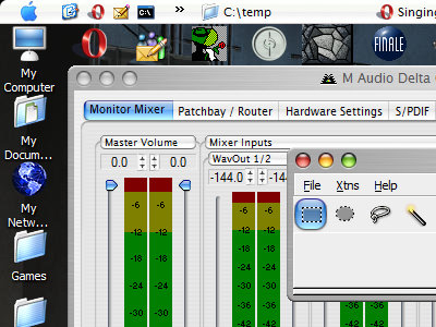

I have to admit, I really like the look of the modern Mac GUI. Not that that's much of an admission, given the Playskool-like design of the default Windows XP interface. The OSX Tiger "Brushed Metal" look is especially nifty.
But I'm not about to give up the PC world just because the interface looks like ass. At the rate I go through hardware upgrades, I'd put myself in the poorhouse if I Switched; hooray for open standards which drive the price down through competition. Not to mention I'd have to spend at least a couple thousand dollars to buy the Mac equivalents of the commercial software I use (although I use freeware whenever possible, sometimes it just doesn't measure up to the pricey stuff).
But... with the right software, the XP interface can be made to look a bit better:
Ahhh. Much better, though after years of the taskbar being at the bottom, having it at the top is kind of disconcerting. Though that's where it was in OS/2, so I should be able to get used to it again.
Ha, which reminds me of a funny story. Once upon a time, back at my previous place of employment, I replaced some of the graphic resources in my Windows 9x machine's system files to make it look as much like OS/2 Warp 4 as I could, and replaced the boot screen with the Warp one. The computer had to go in for service — it was randomly crashing, even when sitting idle, and it was (as far as I could tell) free of viruses and other nasties. The technician didn't even try to diagnose the problem, as "You've got some weird hybrid of Windows and OS/2 on there, and I have no idea where to even start with it." The kicker is that he tried to charge us for service he didn't even attempt to perform. But if there's one thing I can say about my old boss, it's that he was more tenacious than a pit bull when it came to money, so we didn't have to pay for it.
Can't remember the actual idiom.
Take heart, now that Apple is Intel-ing, you'll just have to wait 'til some kid hacks it so it'll run on AMD...
From what I've been reading, it looks like Apple's still going to go with proprietary hardware, without which the OS won't run. I tend to doubt it'll be hackable to work on a vanilla Intel PC. (It's not like they actually want to gain market share or anything.)
I'm curious to see how they'll lock the OS to the machine. By all accounts, the Intel developer box is a generic Intel strapped inside a G5 case.
But is Apple really just a hardware company?
Lisa: What video card and how much RAM do you have installed in your machine?
